Made of Grit by Toronto Metropolitan University
SYNOPSIS
There are some brilliant examples of brand ideas worldwide, but this one stands out to me. I’ve got a lot of respect for this campaign, the team behind it, and how it’s been executed.
After years of building brands and customer relationships outside the higher education sector, seeing this work felt like a breath of fresh air. It has the kind of creativity and punch I’m used to seeing in sectors that know their branding.
Following its renaming from Ryerson University to Toronto Metropolitan University in 2022, James Wentzell, Executive Director of Marketing at TMU noted to Strategy online, “It’s very difficult to launch a new name when you’ve been known by another one for years,” says. But it wasn’t enough for people to know the name, they had to know what it stands for.” *
TMU has created a true ‘something,’ not a forgettable ‘nothing’.
Well, TMU has created a true ‘something,’ not a forgettable ‘nothing’ – which is always the big risk when complex institutions with countless audiences and stakeholders embark on a rebrand or refresh.
[CRHEATE was delighted to chat with Sabiha Smith, Associate Creative Director & Senior Copywriter at TMU, as part of this review.]
CRHEATE REVIEW
Bold Messaging with a Purpose
The Made of Grit campaign perfectly captures TMU’s urban spirit, focusing on the concept of grit. This quality hits home with the city of Toronto and the university’s students, staff, and alumni. TMU positions itself as a university shaped by its surroundings and genuinely connected to its city. And let’s be honest, pulling that off authentically isn’t easy.
The messaging is clear and powerful: TMU students aren’t just passing through the city; they’re a product of its challenges and opportunities.
"We're literally connected by that grit." Sabiha Smith
For me, it brilliantly bridges the physical (cement, grit) with the metaphorical (resilience, determination). The phrase Made of Grit speaks to the university’s evolution this marked a shift in public image and an embrace of a bold future, and this campaign does a great job of celebrating that change while reinforcing TMU’s redefined identity.
A general observation of the sector is that pretty much all universities ‘do’ the same stuff. It's in the 'how' that you might be able to find a new angle – in effect, finding differentiation or distinction through process and narrative rather than just outcomes.
“It's not just about us,” says Smith. “It’s something other people need to be able to relate to. So you think about all these disparate audiences, from government stakeholders, internal audiences, students, and business. But the idea wasn’t conceived just for us – it was for everybody.”
Visual Identity and Urban Grit
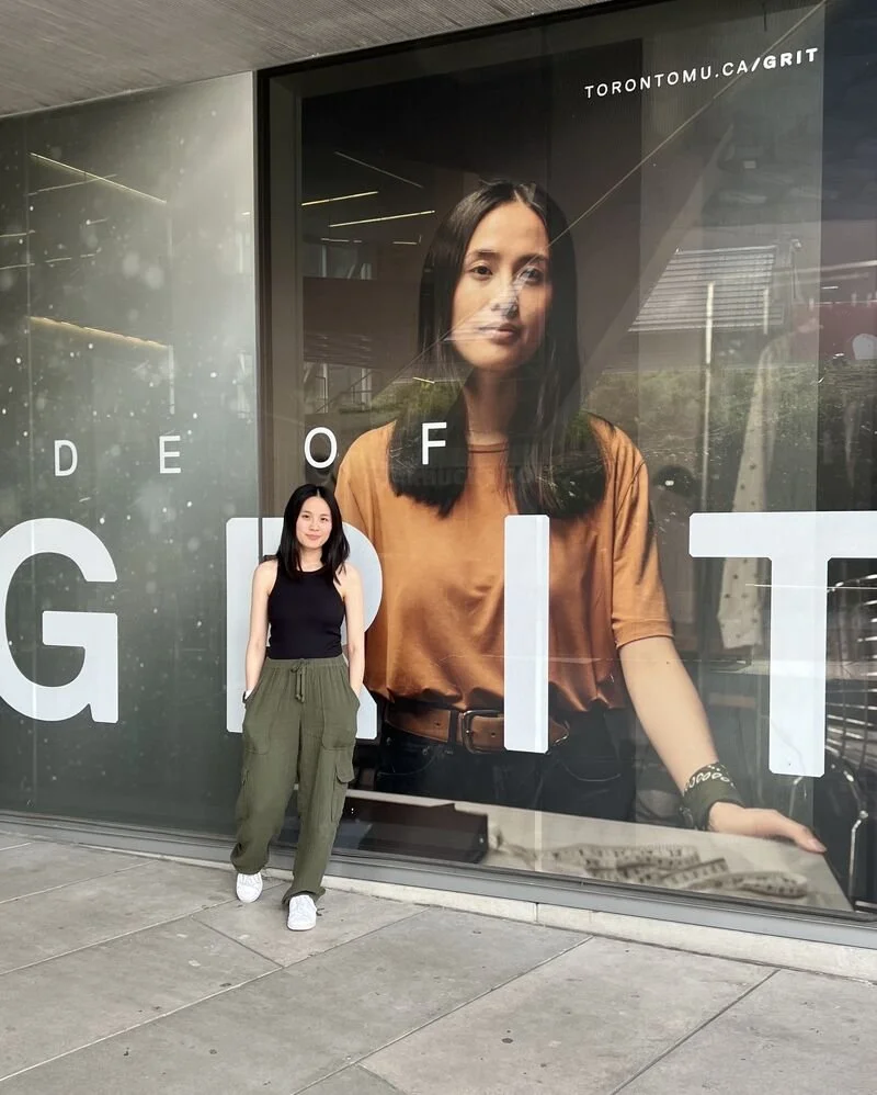
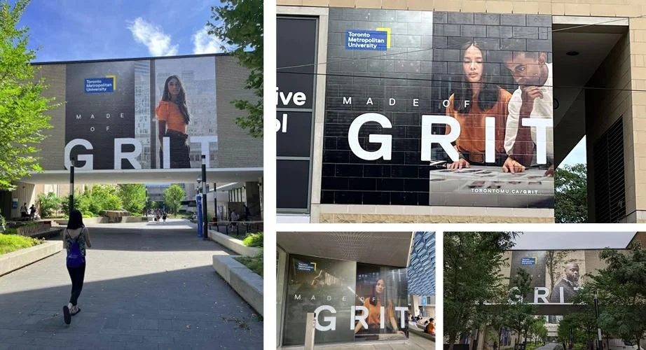
Visually, the campaign hits the mark with a bold, urban aesthetic. Gritty textures and cityscapes immediately connect the viewer to Toronto’s vibe. From construction sites to snapshots of daily life, the imagery shows that TMU isn’t just in Toronto – it’s woven into the city's fabric.
The branding embraces Toronto's rich, diverse culture, spotlighting students and alumni who reflect that diversity. This visual language isn’t just eye-catching; it’s true to TMU’s values of inclusivity and resilience, making the whole campaign feel authentic and connected to the student body.
Celebrating People and Place
One of the best aspects of Made of Grit is how it puts the spotlight on both the people and the place. The story isn’t just about TMU as an institution – it’s about the community it nurtures and the environment that shapes it.
The campaign shows students, staff, and alumni as people who meet challenges head-on and thrive in Toronto's fast-paced, ever-changing landscape. It’s the perfect match for the message that grit isn’t just a trait; it’s a lived experience shaped by place and purpose.
The campaign also aligns well with the university’s strategic goals. By embracing its urban identity, TMU underlines its commitment to accessible, innovative, and practical education that serves the city and beyond. The message is loud and clear: TMU isn’t just turning out graduates – it’s producing resilient, adaptable leaders ready to take on an unpredictable world.
CRHEATE is a big fan of institutions authentically advocating for the journey, not just the results. It's not just about the shiny things, we're going to look at the process. So often that’s where the real stories are.
Strategic Execution
From a strategic point of view, Made of Grit nails it. This isn’t just a rebrand for the sake of it – it’s about embedding that rebrand into the daily life of students, staff, alumni, and everyone connected to the university. It strikes the right balance between celebrating the past and looking ahead to the future.
Focusing on personal and collective grit, the campaign sets TMU apart in a crowded academic market. It shows TMU as more than just another urban university; it’s where the city shapes you, and you shape the world.
And its inherent ‘truth’ has impacted the university's culture.
"We have merchandise in our campus store. It’s exciting to see people walking around with 'Made of Grit' on a shirt or cap."
CRHEATE also likes the way it’s been embraced in the physical spaces on campus, which physically embodies the concept.
"We plastered it on the walls of our campus – literally on the gritty cement walls."
Which is smart, right?
Conclusion: A Strong and Resonant Campaign
TMU’s Made of Grit campaign doesn’t just look good – it feels right. It takes the concept of urban education and turns it into a powerful story about resilience, diversity, and community. In response to the university’s renaming, it’s a triumph that bridges TMU’s past with its bold vision for the future.
With its striking visuals, deep connection to the city, and emphasis on its people, Made of Grit captures exactly what TMU is about. It’s not just a redefinition of the brand; it’s a campaign that stirs pride in the community. TMU really is Made of Grit, and that grit shines through in every element of this campaign.
The campaign has many great details, but most importantly, they nailed the big idea. Hats off to the team for that. It may not have been conceived as a Brand Idea, but in CRHEATE’s opinion, they’ve got one. Possibly the best one.
As we ended our conversation, Sabi said, "I still can't believe I got away with this script."
Well, thank goodness she and the team did. It sets a standard and speaks to boldness and intelligent risk-taking at both a personal and institutional level.
And we can all learn from that.
Three take-outs
-
The campaign's genuine stories and values resonated deeply with its audience, building trust and connection. Staying true to your identity fosters lasting engagement.
-
Made of Grit stands out by celebrating resilience and process over polished results. Creative risks can differentiate your brand and leave a lasting impression.
-
The campaign succeeded by aligning its narrative with diverse stakeholders, creating inclusivity and pride. A cohesive message strengthens engagement across audiences.
The campaign achieved remarkable success, generating over 39 million ad impressions, 33 million video views, and 58,000 page visits – an impressive 79% of which came from new visitors. It also received strong audience engagement and overwhelmingly positive sentiment.
* – https://strategyonline.ca/2022/08/30/tmu-takes-pride-in-its-urban-grit/


